Histograms
A histogram bar's height isn't its frequency — it's frequency squeezed or stretched to make area, not height, the thing that actually carries meaning.
Why histograms aren't just bar charts
A bar chart's bar height shows frequency directly, and every bar has the same width by convention. A histogram is built for continuous, grouped data whose classes might have different widths — and once class widths vary, height alone can no longer be trusted to represent frequency fairly. A wide class with a middling frequency can look deceptively "tall" next to a narrow class with the same frequency, if both were just plotted by raw count.
A histogram plots frequency density on the vertical axis, defined as
$\text{frequency density} = \dfrac{\text{frequency}}{\text{class width}}.$
This makes the area of each bar (density × width) proportional to the frequency it represents — so bars of different widths can be compared fairly, and the total area of the histogram represents the total frequency.
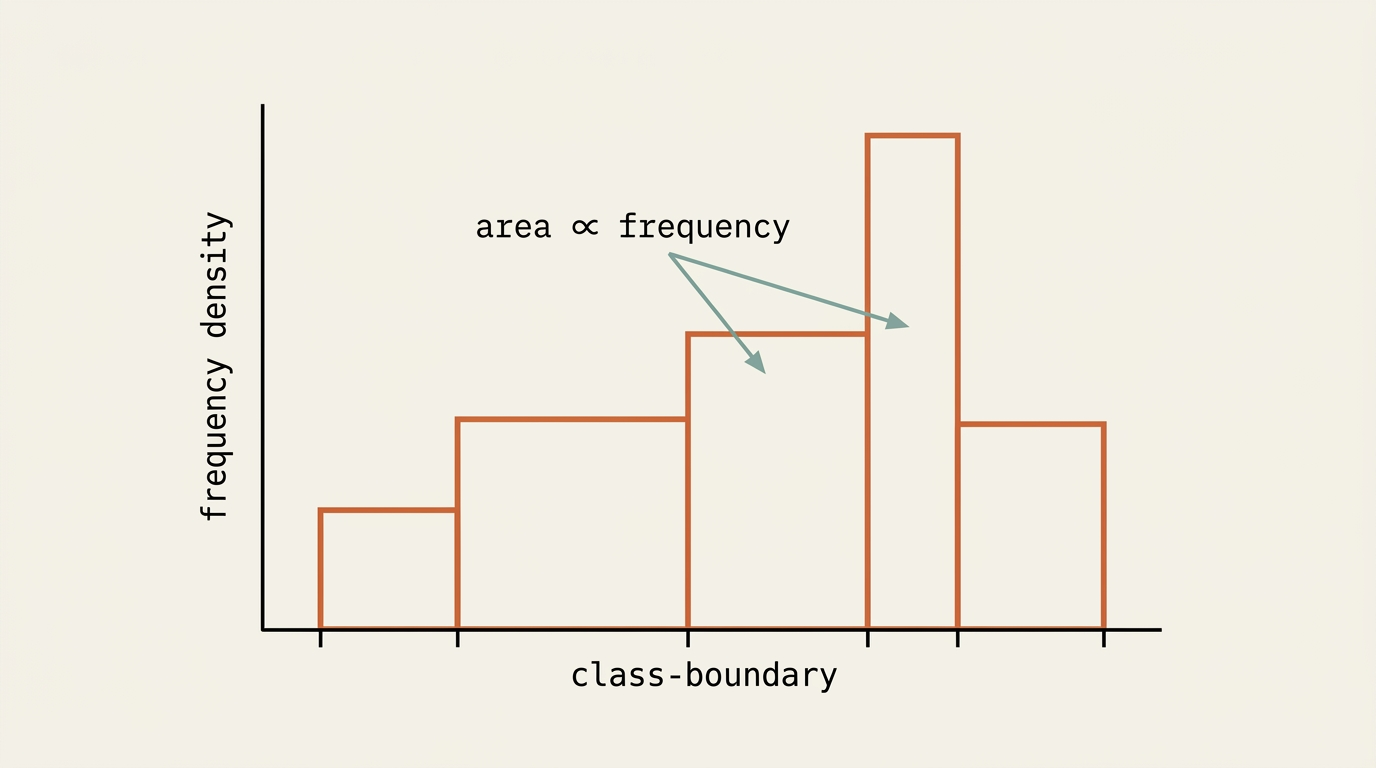
Reading frequencies back off a histogram
Given a histogram (or its frequency density table) and one known frequency, the scale linking area to frequency can be found, then used to read off any other bar's frequency from its area — this is the standard technique for "estimate the frequency of..." histogram questions.
Frequency polygons
A frequency polygon is a simpler alternative to a histogram: plot each class's midpoint against its frequency, then join the points with straight lines. Unlike a histogram, it plots frequency directly rather than frequency density, so it's only sensible to use when class widths are equal. Frequency polygons are especially useful for comparing two or more distributions on the same axes, since overlapping histograms quickly become cluttered while overlapping line polygons stay readable.
Always plot at the class midpoint — for a class $20$–$30$, that's $25$, not $20$ or $30$. Plotting at a boundary instead of the midpoint is the most common frequency-polygon error, and it shifts every point in the diagram sideways.
Worked example 1
Time: 0–10, 10–20, 20–40, 40–70 · Frequency: 12, 18, 20, 15
Always find the class width by subtracting the class boundaries ($40-20=20$, not just "20" from the label) — misreading grouped-class widths is one of the most common histogram errors.
Worked example 2
Frequency density and class width are always linked by a simple rearrangement: $\text{frequency} = \text{density} \times \text{width}$. Whichever quantity a question withholds — density, width, or frequency — the other two, once known, pin it down directly.
Worked example 3
Reading "which bar is taller" off a histogram and assuming that means "which class has more data" is exactly the trap unequal class widths create. Class $B$'s bar is taller here, but class $A$ has more data — always compute area when widths differ.
Worked example 4
Some exam questions give the scale between area and frequency directly, using measured centimetres on the printed diagram rather than the underlying data values.
This "cm² to frequency" scale factor is just a disguised version of the density-width relationship — the printed diagram's centimetres stand in for the real data's units, and the given ratio (frequency per cm²) plays exactly the role that dividing by class width normally plays. The core idea, area proportional to frequency, never changes.
Never read a frequency directly off the vertical axis of a histogram — that axis is frequency density, not frequency. Frequency always requires multiplying density by the relevant class width (or a given area-to-frequency scale), even when every class happens to share the same width.
Check yourself
A histogram class has boundaries $30$ and $50$, and frequency density $1.4$. Find the frequency of that class.
(Hint: find the class width first, then multiply by the density.)